• +45 70 27 05 04
  • Support
  • Dansk

The good product page - Part 4: UI Elements


May 21, 2023

After having addressed more specific and narrowly defined areas of the product detail page, we’ll now zoom out a bit and focus on some of the page’s primary interaction points.

In the previous posts, we covered image and text quality as well as how product variants are displayed on the product detail page. In this post, we turn our attention to some of the UI elements that are often subject to extensive testing and evaluation when the purchase experience needs fine-tuning on a webshop.

Even with the most stunning images, well-crafted descriptions/specifications, and a variant selector that ticks every box, the product detail page can be nearly unusable if proper attention isn’t given to how the user interface itself is designed.

In this article, we’ll dive into two classic elements of the product detail page: the image gallery and the purchase section.

Image gallery

The visual platform for product details.

Goal: "Hard to miss and easy to navigate"

An image gallery on a product detail page is a collection of images showcasing different angles and details of the product.

It gives customers a better idea of the product’s appearance and features before they decide to purchase it. Image galleries can include zoom functions and, in some cases, allow users to view the product in different colors or sizes, depending on how the gallery is set up.

The primary image

In the first article, we presented a series of considerations to keep in mind when working with image motifs.

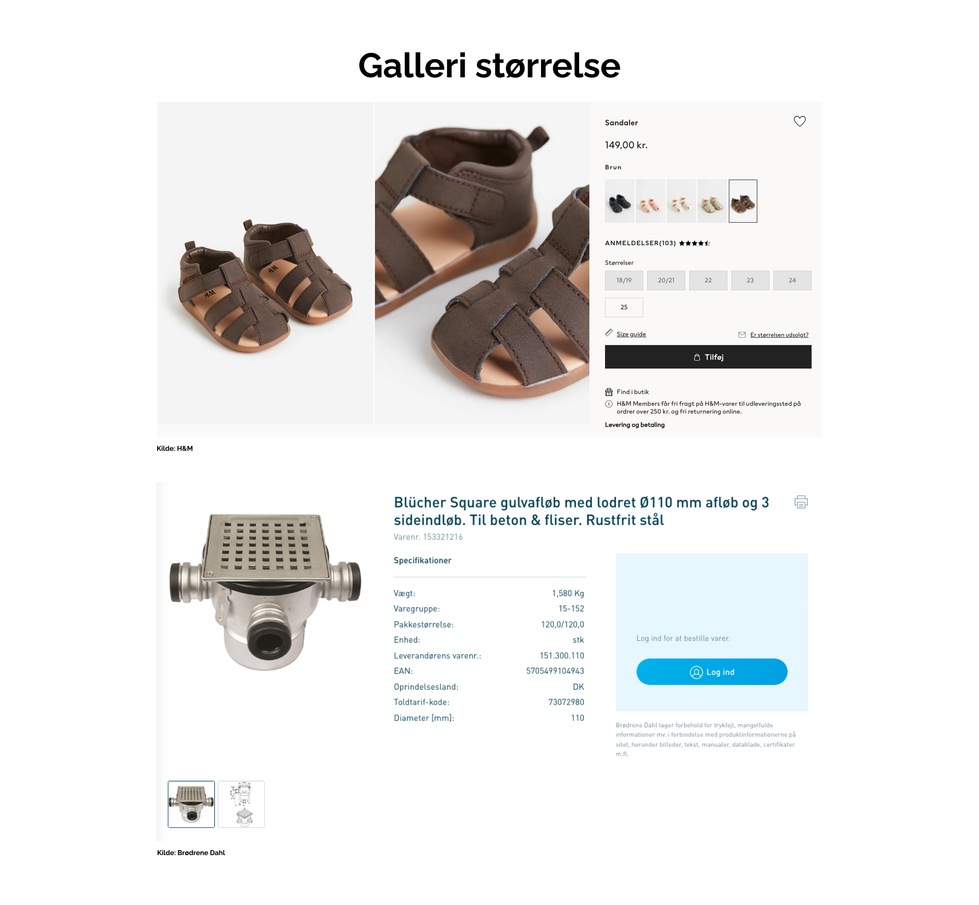
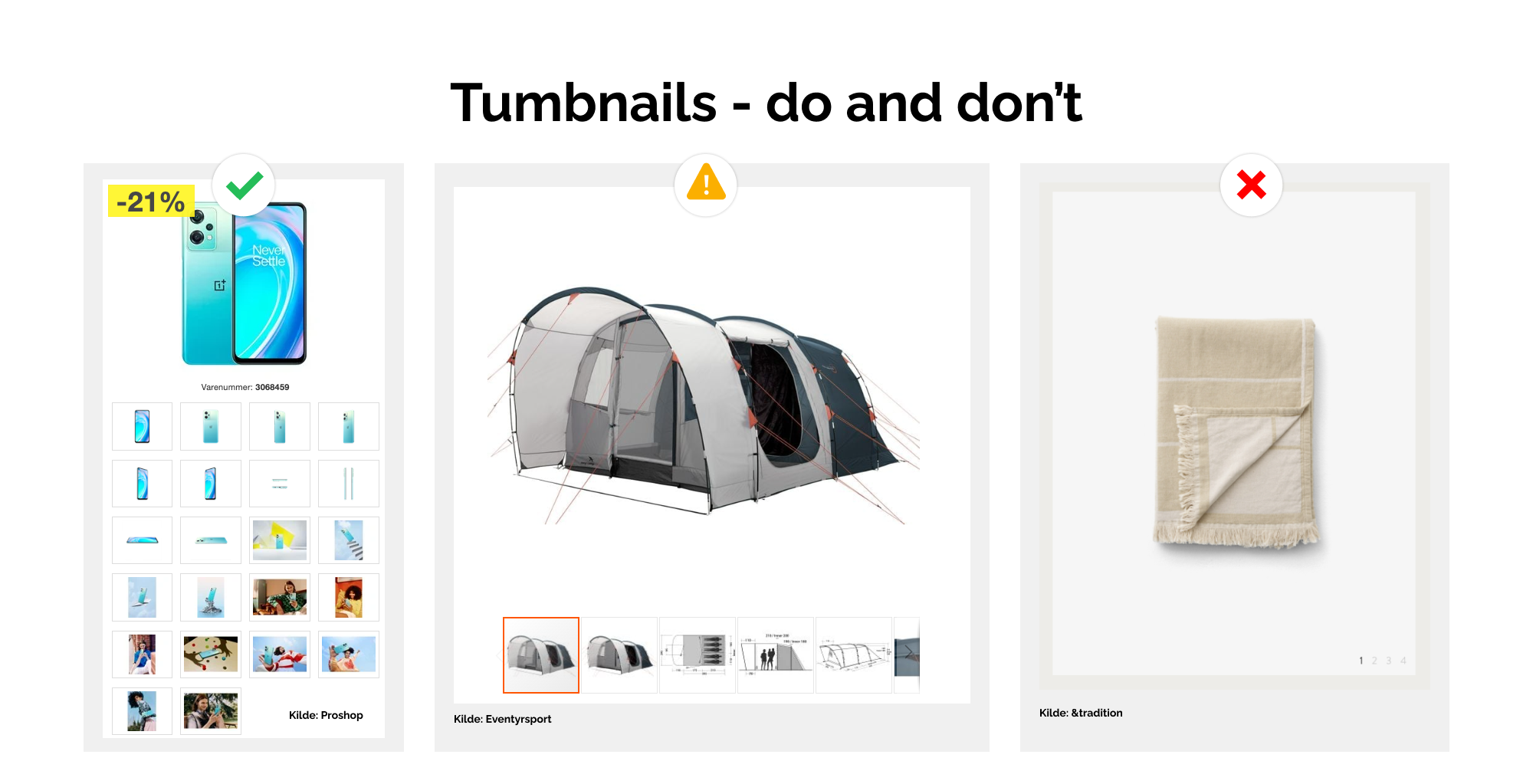
In this section, we go through recommendations on how images are best presented in a gallery format. And yes, there is almost always a need for a gallery when you have 3-5 product images per product (as we also recommended earlier).

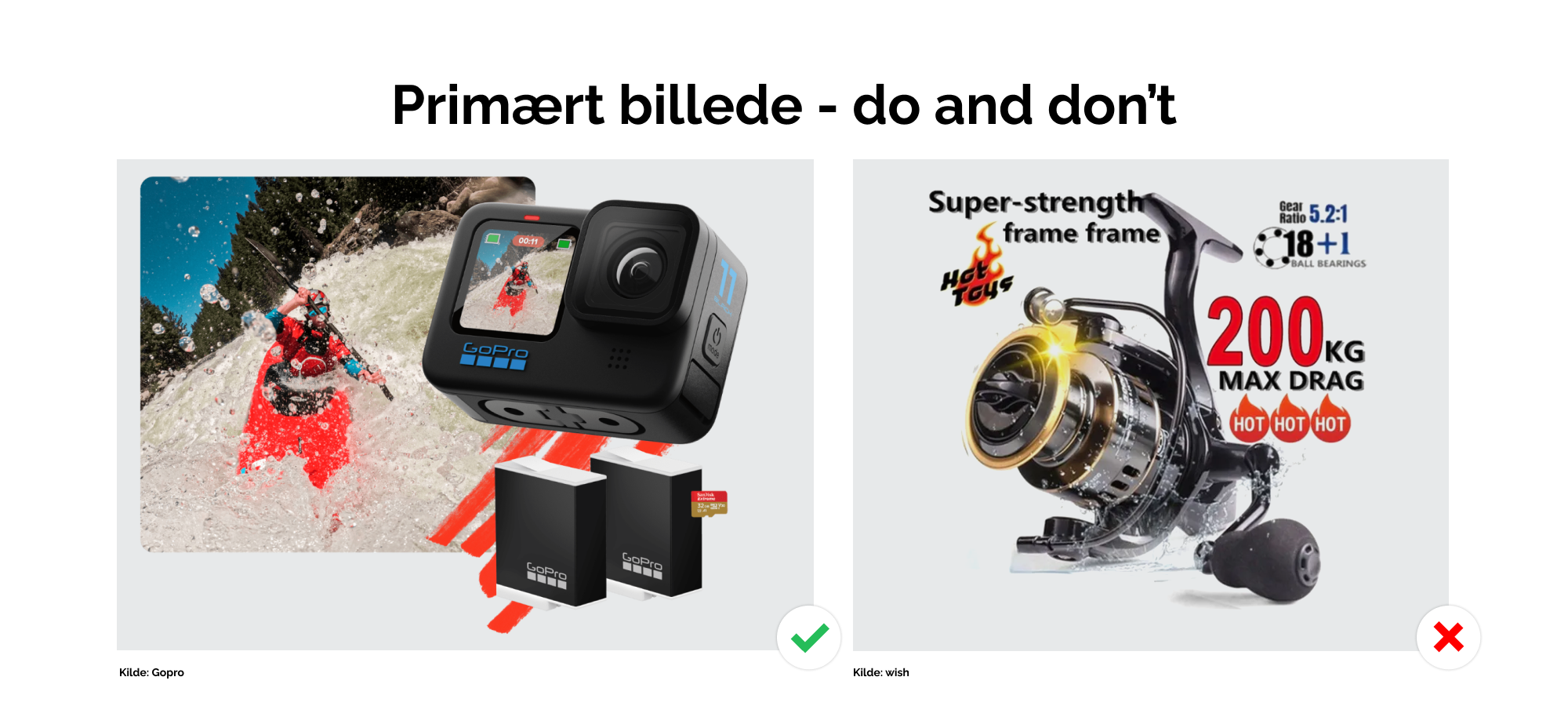
Choosing the primary/main image

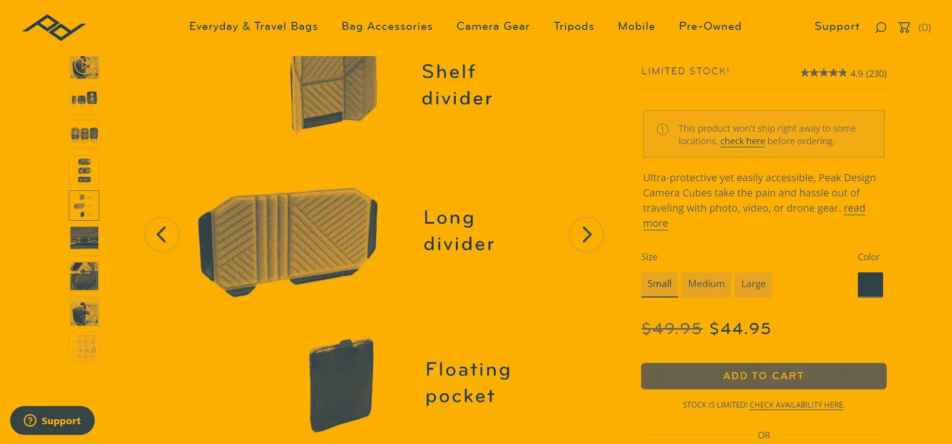
"Which image should we show first?" This is an important question, as about 31% of users judge whether they have found the right product based solely on the primary image. Therefore, the image should contain as many important visual information about the product as possible.

What are “important visual information”? It depends on what makes the product unique. If the product has accessories, it may be advantageous to show these in the main image. If the product has special features – for example, being waterproof – these can also be illustrated directly on the image, for instance using a label or graphic.

The size of the image gallery

Following the above recommendation, one should consider the size of the image. The user must be able to see the details you want to highlight. If the image is too small, it becomes difficult to decode these details.

A rule of thumb is that the image gallery should occupy at least 50% of the page width when dealing with products that have significant visual characteristics.

Of course, there is a difference between selling nuts or finger rings. For nuts, specifications are often more important than the image, whereas the details of a ring and its craftsmanship are the core of the user’s experience, and therefore require larger and more prominent images.

What to consider?

Benefits and practical steps you can control

  • Consider whether your products are visually driven

    You may sell products where visuals play a crucial role, as well as products where visuals are less prominent. Still, carefully consider whether you primarily sell products that benefit from large images. If there is a 50/50 split between product types, we recommend creating a large image gallery, since it is better for the user to see a less visually driven product in a large image than the opposite. Also, check that the size on both desktop and mobile allows the important visual information to be seen without zooming.

  • Choose or create a good primary image

    If the product has a unique feature (e.g., “waterproof”), it makes sense that this can be understood from the first image. If the product’s size is important, it makes sense to show an image with the product in a recognizable scale. In other words, choose the image that best reflects the product’s selling points in a clear and easy-to-understand way. And if you have not received such an image from your supplier or manufacturer, it may make sense to enrich the image yourself with the product’s USPs (Unique Selling Points). The pitfall is that you “clutter” the image with text describing the product, which is not always an elegant or user-friendly solution (see below for an example of a good and less good primary image).

GoPro’s primary image clearly shows that the package includes two batteries and a memory card, while also indicating that the camera can be used underwater. In contrast, Wish has cluttered their image with so much information that the user can hardly see the product itself. Also, consider whether you can interpret what 3x flames with the word “Hot” indicate about the product’s USPs.

The difference between the visually driven product at H&M and the specs-driven product at Brødrene Dahl is clearly reflected in the size of their image galleries.

Thumbnail Images and Zoom

How can an image gallery support the user’s discovery of your great images? The answer is thumbnails and zoom.

Thumbnails – show how many images/videos/3D models you have

There aren’t many webshops where all images are shown in large format on the product page (like H&M), meaning the images lie outside the first screen the user sees.

The most common display is one where a row of smaller thumbnails is placed next to the primary image, thereby creating a combined gallery function.

Our recommendation is that you show all the thumbnails you have. If you hide some thumbnails in a carousel or a “slider,” it should be clearly indicated that there are more images beyond the current view (e.g., by using arrows, buttons, or other visual elements).

The size of each thumbnail can advantageously be around 40–70 pixels in both height and width. Also, ensure that both the primary image and thumbnails are visible together without scrolling on both desktop and mobile.

Zoom functionality – show the details

If you have high-quality product images, most users will appreciate being able to zoom in and inspect the product’s details further. So how is a good zoom function implemented?

Basically, there are three different UI types, each with their advantages and disadvantages:

1. Instant zoom when the mouse moves over an image (“hover”)

Advantages:

    • Simple interaction requiring no additional clicks
    • Easy-to-use interaction that only requires a simple mouse movement

Disadvantages:

    • This interaction should be supported by a visual “hint” so users discover the zoom possibility – this requires additional design solutions to become a good user experience
    • The hover function does not work on mobile phones, so there will be different user experiences across devices. Therefore, do not make this feature the only way to examine image details

2. Zoom by clicking on the image

Advantages:

    • Magnification is shown only on active user action – there is congruence between action and screen
    • This interaction also works on mobile devices without a mouse

Disadvantages:

    • A good implementation requires the cursor to change shape, which demands extra development

3. Zoom by clicking a button or icon

Advantages:

    • The user can immediately recognize that the image can be enlarged if the icon/button uses familiar symbols or wording
    • This interaction also works on mobile devices without a mouse

Disadvantages:

    • If buttons/icons are placed on top of the image, they can obscure parts of it
    • If buttons/icons are placed on top of the image, colors and contrast must be considered so they are visible regardless of the image behind

What to consider

Benefits and practical steps you can control

  • Show all thumbnails

    Make sure to display as many thumbnails as possible in connection with your image gallery. We recommend placing thumbnails below the main image, as this allows thumbnails to fill downward on the page.

  • ... or make it clear that there are more than what the user can see

    Make an effort to provide visual hints indicating that there are more images. This can be something as simple as an illustration of an arrow indicating that the gallery can be scrolled further. NOTE: although it is a well-known trick to have the last image cropped to indicate continuation beyond the screen, it is a visual hint that can be easily overlooked when standing alone.

  • Ensure that both the main image and thumbnails are visible on all screen sizes

    For many users, it is an annoyance to have to scroll up and down to navigate an image gallery. If, against our recommendation, you let thumbnails lie outside the view or disconnected from the gallery, make sure there is auto-scroll back to the main image.

  • Check your zoom overlay

    If you do not use zoom type 1, where zoom is shown on hover over the main image, you will most likely work with an overlay that displays the larger version of the image. Ensure that this fills at least 80-100% of the screen, and that the image size matches the screen size. You can optionally offer the user the option to zoom in further and thus get scrolling on the image.

Three examples of how thumbnails are displayed: Proshop shows all their images below the main image, leaving nothing to guesswork. Eventyrsport has a carousel with thumbnails and has marked with an arrow that there are more images, but the marking is hard to see. &tradition indicates more images with numbers, which looks quite elegant, but requires more effort to decode that this relates to the selection of the main image.

The price of the product

For the vast majority of purchase scenarios, the price is the most important piece of information for the user, and it is therefore incredibly important to have this as one of the most prominent elements on the page.

Whether it’s the font size, its weight, or the overall design that makes the difference is up to the brand’s guidelines and your taste. Regardless, the user should be able to find the price without much effort. Remember that color alone is not a good differentiator, as the accessibility of information for, for example, colorblind individuals, is poor.

The price should ideally be located in the purchase section and displayed together with any original prices and savings. However, avoid filling the purchase section with unnecessary information.

As a rule, the price should only reflect 5 elements:

  1. The actual price (possibly indicating whether it includes or excludes VAT)
  2. Original price
  3. Savings
  4. Possibly unit price for bundled products
  5. Any information about why this price applies, e.g., “promotion” or “member price.”

What to consider?

Benefits and practical steps you can control

  • Perform the squint test again

    If you’re unsure whether the price is visible enough, you can perform a squint test again. Does the price stand out from the other elements?

  • Review the 5 price elements

    If the 5 price elements are spread out across the page, you should consider gathering them in the purchase section in an easily understandable way. The goal is ultimately for the customer to understand what they are paying and why. The aim is not to pack as much information as possible into as little space as possible.

Both Greenline and nemlig.com manage to display the original prices, the amount saved, and a relatively prominent current price. Nemlig.com also shows a price per liter, and both do a good job of indicating how long the offer is valid.

The Quantity Selector

In the same area where the price is typically shown, we often also provide a way for the user to change the number of products they want to add to the cart.

In this context, it would be helpful to inform the user what one "unit" actually represents (liter, meter, cm, gram, kilo, pallets, etc.).

Consider the following example:

I am looking at a drinking glass that I find really nice. Somewhere in the product description, it states that they are sold in packs of 6. But if I haven’t read this carefully, I might reasonably look at the quantity selector below and mistakenly think I am buying 1 glass:

What if the quantity selector instead worked in increments of 6? Or at least clearly addressed what one unit means near the selector:

What to consider?

Benefits and practical steps you can control

  • Pre-fill the quantity selector with the minimum number of items

    This is probably obvious, but it’s still worth mentioning that the selector should be set to 1 if that is the smallest quantity the user can buy. If the minimum purchase is 6 units, the selector should default to 6 if a “pcs” designation applies. These considerations again lead to a discussion about how product data is enriched, for example in a PIM system.

  • Have plus and minus buttons and a text field to change quantity

    It should be easy on both desktop and mobile to adjust the quantity by pressing plus or minus, and the user can also type the amount directly in the field. NOTE: remember the buttons should be at least 36x36 pixels on mobile and have enough spacing so they’re easy to tap. On mobile, it’s also good practice to auto-select the number in the text field when tapped and to show the numeric keyboard by default — so the user only has to enter the quantity.

  • ... unless you sell in fixed quantities or a max amount

    The above solution doesn’t work well if you sell products in fixed quantities (e.g., 1, 5, 250, 1000 pcs). Here, a dropdown menu is better, since it’s not logical that a single press of plus jumps a (for the user) random number. If you have a low max quantity that can be purchased—say between 1 and 10 pcs—a free-text field might give the impression the user can choose any quantity. If that’s not the case, either an explanatory text or a dropdown menu is a good alternative.

  • Adjust the price with quantity discounts

    If the user gets 10% off when buying 2 pcs, it’s a great idea to reflect this in the price on the page when the quantity changes. Alternatively, you can show text encouraging the user: “Buy one more to get 10% off.”

These are two good examples of quantity selectors — Xl-byg has plus and minus buttons as well as an editable text field. At the same time, they indicate what one unit represents. Vistaprint, on the other hand, sells their stickers in fixed quantities with unique prices — here, a dropdown makes a lot of sense.

Save / Favorite / Wishlist

A survey among nearly 4,000 American shoppers about how they “save” products online that they are not quite ready to buy shows that 46% use either a wishlist or a “Save Cart” functionality. This contrasts with the mere 26% who just leave the products in their cart (Source: Baymard [Behind paywall]) (2022).

Therefore, it makes good sense to consider how you support your customers’ needs to remember products they cannot/will not/may not/want to buy right here and now. So what should you consider regarding this saving list? According to Baymard, the following considerations are central:

  1. Is login required to use the feature (e.g., the wishlist)?
  2. How do you make users aware that the functionality exists?
  3. Find a good balance for how visible the functionality is — it must not “overpower” more important UI elements
  4. How do you make it easy to retrieve saved products again?

What to consider?

Benefits and practical steps you can control

  • Consider whether the functionality should be behind a login

    Up to 75% of webshops with a wishlist feature hide this functionality behind a login, meaning the user must create an account or log in before they can use the feature. This seems like a bold choice when about 24% of online shoppers avoid buying from stores that require account creation to complete checkout. Therefore, consider whether it’s a good idea to hide the functionality from users who are not logged in.

  • Information about the functionality

    How long are products saved on the wishlist? Can I see them across my devices? What if the price changes? What if the product is back in stock? There can be many questions related to the wishlist that may cause frustration if not addressed upfront. Consider if and where you communicate this.

  • Balance placement and design

    It’s a good idea to consider how prominent the feature should be on your product detail pages and listing pages. For example, there is a difference in the length of the decision-making process when buying groceries on Nemlig.com versus buying a car on Tesla.com. So if your products require a longer decision process, a more prominent placement and design could be wise—but remember that the purchase functionality should still be more prominent.

  • Where should the function be placed visually?

    Wishlists are typically placed in connection with or above the image gallery. This is usually near the top of the page, making the functionality accessible without the user needing to scroll.

  • Best practice design

    Consider using familiar icon metaphors like a heart, star, or list. Label the feature clearly on a button, e.g., “Save to Wishlist” or “Add to Favorites.” Whether you choose a text button or an icon, it should not be more prominent than the buy button.

  • Make it easy to find saved products

    It’s now standard to have an icon for the wishlist/favorites near the cart icon - others use “floating” buttons that follow the user down the page. Whatever you choose, we recommend a visual change in the design when a product is added to the wishlist.

Here are three good examples of wishlist/favorite functionality that are both easy to recognize and help the user understand where their saved products go. Imerco shows an orange bubble in the header, while both Jem & Fix and Ikea display a message containing a link to the list.

Stock status

"Out of stock"

When the user encounters this message, you risk sending potential customers to a competitor. When a product is out of stock, it prompts the user to ask themselves the following questions:

  • Will the item ever be back in stock?
  • How long will it take before it’s back?
  • How will I find out when the item is back in stock?

There are basically two possible approaches here:

  • Allow the customer to purchase the product even though it is out of stock
  • Give the customer the option to be notified when the product is back in stock

The latter, however, less often leads to a sale for two reasons:

  1. The period is undefined – will they get an email in a week or two months?
  2. If the customer then receives an email, their interest in the product may have decreased or been replaced by an alternative solution

Therefore, we recommend, if it is technically, resource-wise, and accounting-wise manageable, to allow the customer to purchase the product even though it is out of stock.

Another useful scenario is to refer to alternative products when a product is unavailable. This is especially beneficial if you don’t know whether the product can be restocked. This way, you offer the customer an alternative solution to their need, which is better than nothing.

What to consider?

Benefits and practical steps you can control

  • What technical and resource capabilities do you have?

    If it is possible for you to allow customers to purchase products that are out of stock, this is a good and user-friendly solution. Alternatively, you can consider offering customers the option to register their interest in a product.

  • Do you sell seasonal products?

    There are probably not many who want to wait until January 1st for a Santa costume. If your selection is seasonal or time-limited, working to ensure the above may be wasted effort, as the demand will disappear on its own.

Linaa here offers the option to add out-of-stock products to the cart while reminding the user what this entails. BR allows pre-ordering of products that have not yet arrived in stock.

Shipping and Returns

Shipping Cost

One of the primary reasons why customers abandon their carts is due to high shipping costs. So how do you ensure the lowest possible shipping expenses?

Of course, there are good reasons to work with multiple suppliers offering different price points, but this also reminds us to set realistic expectations for shipping costs before the customer reaches the cart. This can include:

  • The lowest shipping cost achievable for the given product
  • Criteria for qualifying for any free shipping
  • Any indication if the product can be picked up, and if so, where

Returns

Even when everything goes perfectly with the order, sometimes a product may not meet the customer’s expectations and needs to be returned. Providing customers peace of mind that returns are hassle-free can reinforce your credibility and remove the last barrier to purchasing a product.

What to consider?

Benefits and practical steps you can control

  • Do you have a good return policy?

    Show it prominently and use it as reassurance that you are a trustworthy business. More and more shipping companies offer standardized return portals that you can integrate with. This makes it easy for both you and the customer!

  • Are you providing a fair indication of the shipping cost?

    If you offer free shipping above a certain amount, make this clear to the user. Alternatively, you can give an estimate of the shipping cost. Also, only show the cheapest shipping option if it is realistically a choice your customers would want. Even if a product can be sent as regular mail, it might not be the most desirable option for the customer, and the price could therefore be misleading.

Here are three good examples of shipping prices and return information.

Read the other posts in the series

The good product page - Part 3: Variant display

Products with many variants are often a time-consuming aspect in the design phase for several reasons. A good webshop should make it easy for the user to navigate between different products, their variants, and their various features.
The good product page - Part 3: Variant display

The good product page - Part 2: Texts

In the previous post of the series, we examined the product page’s images and their function. In this post, we turn our focus to the product page’s texts. Images cannot (and should not) stand alone, and for the sake of both the customer experience and SEO, product descriptions are important elements in
The good product page - Part 2: Texts

The good product page - Part 1: Images

A picture is worth a thousand words. In a virtual store where the item cannot be taken off the shelf and inspected, images and media are the best way for the user to verify whether the product is “what I’m looking for.” In 2022, images and other media are therefore critical
The good product page - Part 1: Images

The good product page - Part 5: Reviews and Cross Selling

So you’ve got images, texts, variants, and the purchase section under control – perfect! It’s time to shift focus to supplementary content such as reviews, documents, and alternative products.
The good product page - Part 5: Reviews and cross-selling

The company

PicoPublish
Stagehøjvej 27E
8600 Silkeborg
+45 70 27 05 04
info@picopublish.com
CVR: 31086876
  • Cookies
  • Privacy policy

SKI-certified supplier

SKI info

PIM

  • What is pim
  • Systems
  • Integrations
  • Data process optimization
  • What does a PIM-system cost?

Websites & ecommerce

  • Web and ecommerce
  • Websites
  • Ecommerce
  • Digital Design

Sustainability reporting

  • Sustainability reporting
  • ESG - a new umbrella term for sustainability data
  • What is DPP (Digital Product Passport)?
  • What is CSRD?
  • What is ESRS?
  • What is EPR?

Newsletter

Follow us here

Gazelle
  • 2015
  • 2016
  • 2017
  • 2018
  • 2019
  • 2024
Copyright © 2021 PicoPublish