March 8, 2023
Products with many different variants are often among the most time-consuming aspects to design when building a new webshop. In this post, we outline a series of best practices for displaying complex products with many variants and attributes.
Products with many variants are often a time-consuming point in the design phase for several reasons.
A good webshop should make it easy for users to navigate between different products, their variants, and their various attributes.
Baymard Institute, through their numerous design reviews, has noted that even small details related to structuring and presenting information at the variant level are reasons users abandon a given page:
"Time and again, we’ve observed that seemingly small implementation details around the structure and user interface for product variations are the direct cause for product and site abandonments." - Baymard Institute, Premium paywall (source)
Therefore, in this post, we take a closer look at a number of measures that support a good user experience:
- Distribution of information at the product/variant level
- Preselected variants – do's and don'ts
- Handling of colors
- Handling of sizes
- "Optional extras"
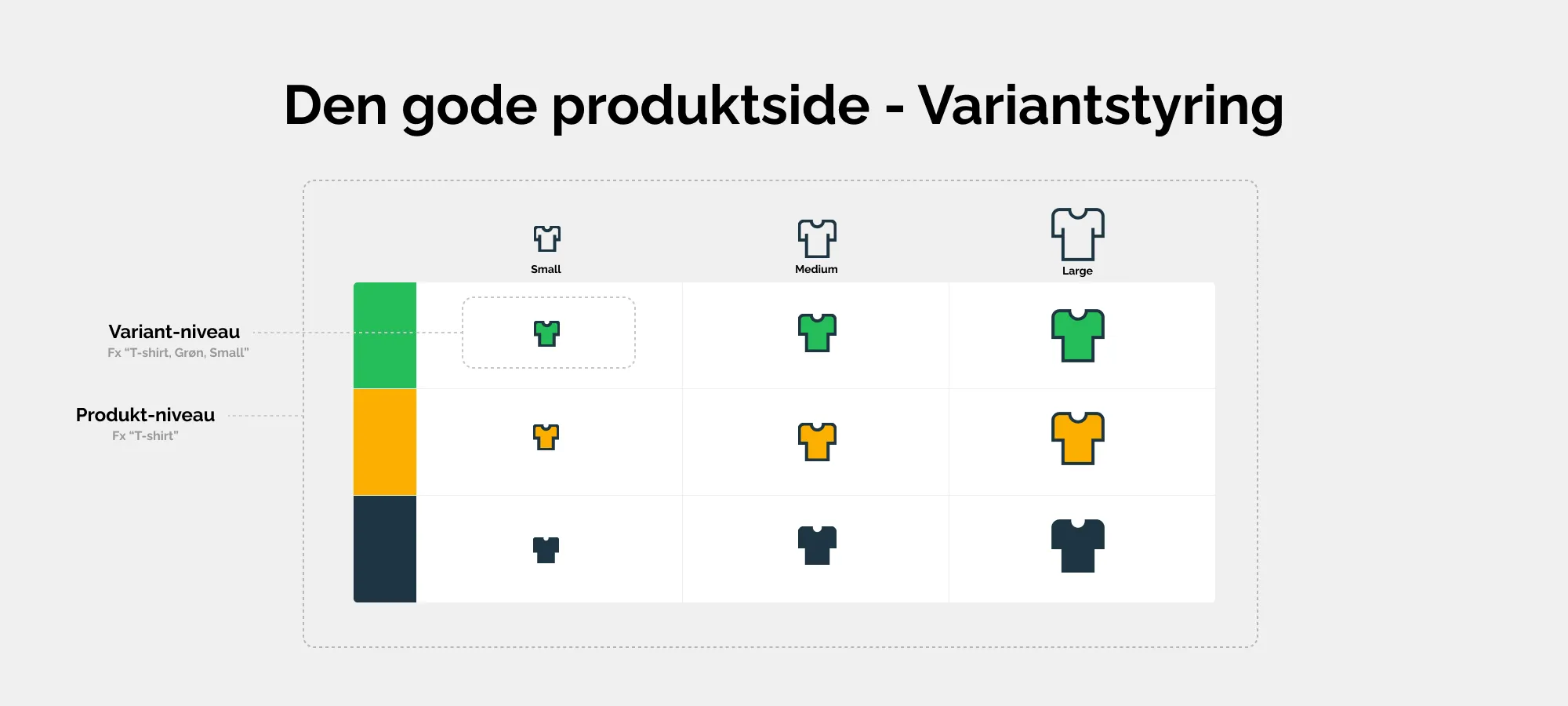
Variant management helps your users navigate between different products and their various variations. "Product" refers to the overall product, while "Variant" refers to the different versions of the product.
Distribution of information at product/variant level
What to consider
Benefits and practical measures you can control
Ensure correct data inheritance (e.g., texts)
Most ecommerce solutions will allow you to implement data inheritance. Simply put, this means that a given product (e.g., “T-shirt with pocket”) is enriched with data about size, materials, etc., at the top level, after which various variants (i.e., different sizes and colors of the product) automatically use the product’s data. This way, you avoid maintaining and duplicating data at multiple levels, enabling smart reuse.
Better to have too much data than too little
As long as your design is good and the data does not make your product pages heavy or difficult to navigate, you can advantageously work with full inheritance and enrich the products with any necessary additions.
Remember to ensure you share the same information across variants. Besides missing out on getting full value from the media/texts you produce, it also degrades the user experience.
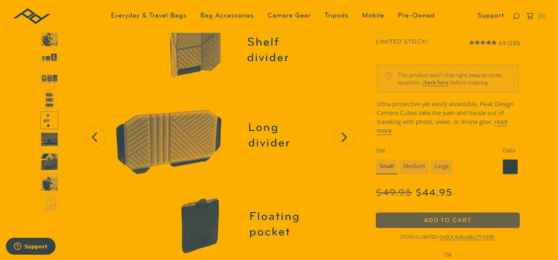
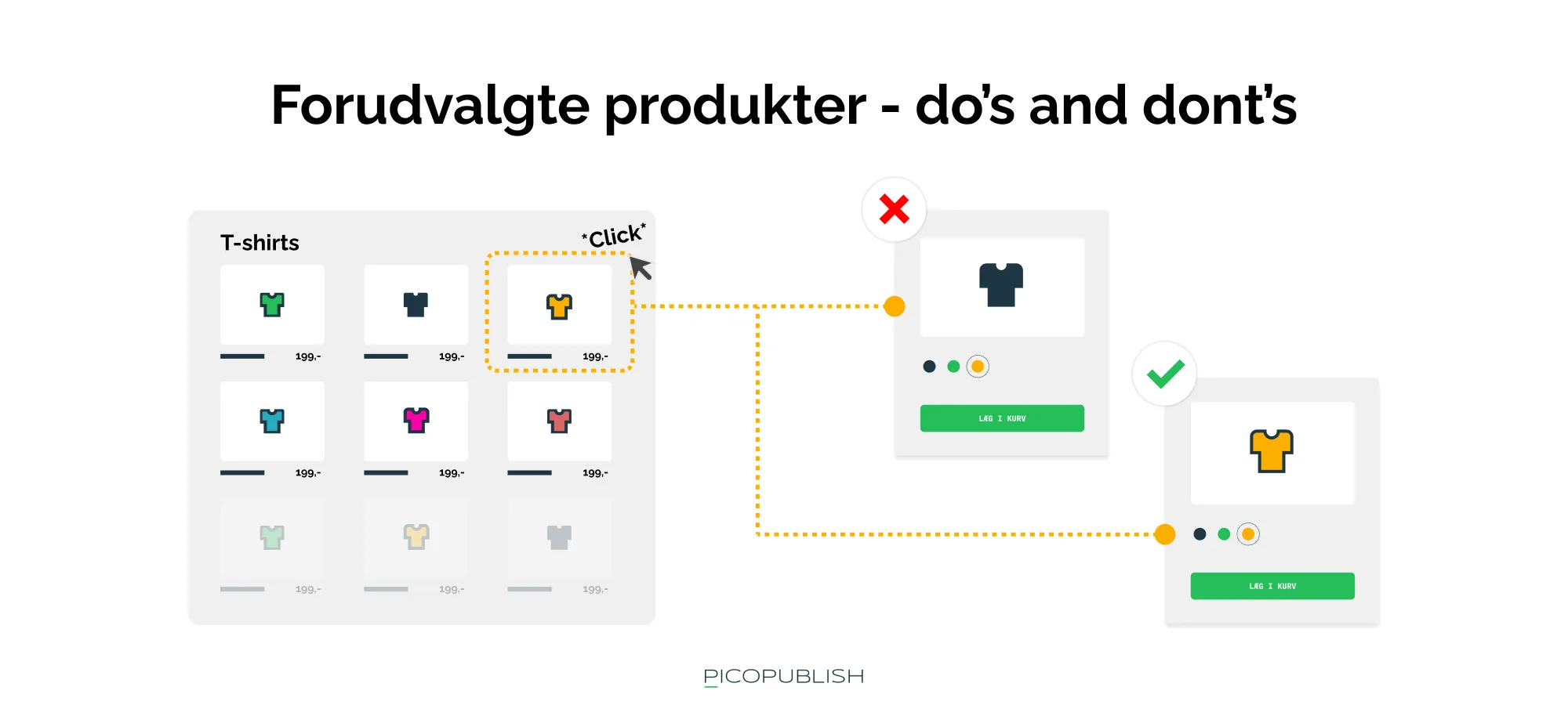
Preselected variants – do’s and don’ts
Preselected variants refer to options that may already be chosen when a user visits a product page.
To ensure a good user experience, it’s important that the choices users make—such as on product listing pages—are reflected on the product detail page itself. For example, if a user clicks on the black variant of a T-shirt from a product overview, they should be taken directly to the black variant on the product detail page.
This might sound obvious, but it’s one of many details that can easily be overlooked when building a webshop.
Your solution should therefore support reflecting the user’s selections and/or searches in the images and texts displayed on your site.
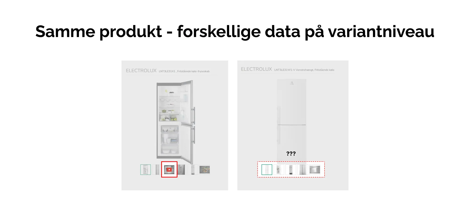
An example of a poor design choice:
- A user searches for “Black T-shirt” on your webshop
- In the search results, the user sees the product “Premium T-shirt” and a photo of a black T-shirt
- The user clicks on the search result and is taken to the product page
- On the product page, the image is no longer of the black T-shirt, but instead a red T-shirt. However, the color selector still shows the black T-shirt as selected
- The user now needs to spend time verifying that the correct product variant is selected, which can cause frustration and increase the fear of ordering the wrong item.
Therefore, you should always make sure to retain the user’s choice when navigating between pages.
If customers feel uncertain when navigating your site, you risk losing their trust—and with it, a sale.
What to consider
Benefits and practical actions you can control
Create clear, precise variant selectors
If your variant selectors are noticeable enough that the user does not overlook them, it is much easier to overview the choices made regarding variants.
Notify the user about missing variant selection
If the user tries to interact with a product that requires an active choice (e.g. size or color), you can advantageously ensure the user receives a clear notification that further choices are necessary. Typically, the possibility to add the product to the cart is completely restricted if the configuration/selection of product and variant is not satisfactory.
Ensure that your product catalogs and product and variant pages are connected so that users are not presented with “default” variants or incorrect product pages when navigating from, for example, a search page in your webshop.
Color handling
One of the most common product variations is color differences.
Therefore, color selectors on variants are also among the most frequently used elements on webshops.
When it comes to displaying choices and variations to the user, most today use two methods:
- Text-based variant selectors
- Symbol-based variant selectors
The text-based variant selector
A classic example of text-based display of variations is the well-known dropdown selector. Dropdowns are now so familiar that they instantly allow the user to decode that there are multiple options.
The biggest limitation of dropdown selectors is that they require more clicks (and possibly scrolling), and they do not provide the user with any visual cues to work with.
The symbol-based variant selector
Unlike text-based variant selectors, symbol-based variant selectors are easy to decode quickly (provided they are well designed).
A typical example of a symbol-based variant selector can be an element for choosing colors, commonly called "Swatches" — meaning "colored boxes".
Swatches make it easy to see which colors are available and make it simple for the user to decide on a variant without having to decode a lot of text and make unnecessary clicks on the screen.
Other symbols could be icons (patterns/logos) or thumbnails (illustrating differences in, for example, design or similar).
What to consider
Benefits and practical actions you can control
Remember to distinguish between product attributes
Swatches give us a better way to assess, for example, colors than text does. However, text can convey information very precisely that might be left open to interpretation in a symbol. Furthermore, text is extremely accessible, making it a great help for people with visual impairments.
Increase accessibility by using both text and icons
By combining the use of symbols and text, for example by displaying text when a user selects a variant via a swatch, you ensure high usability AND increase the accessibility of your site. Accessibility is and will increasingly remain an important focus area. This is reflected, among other things, in Google's "Lighthouse" technology, which is often used to measure website speed and usability.
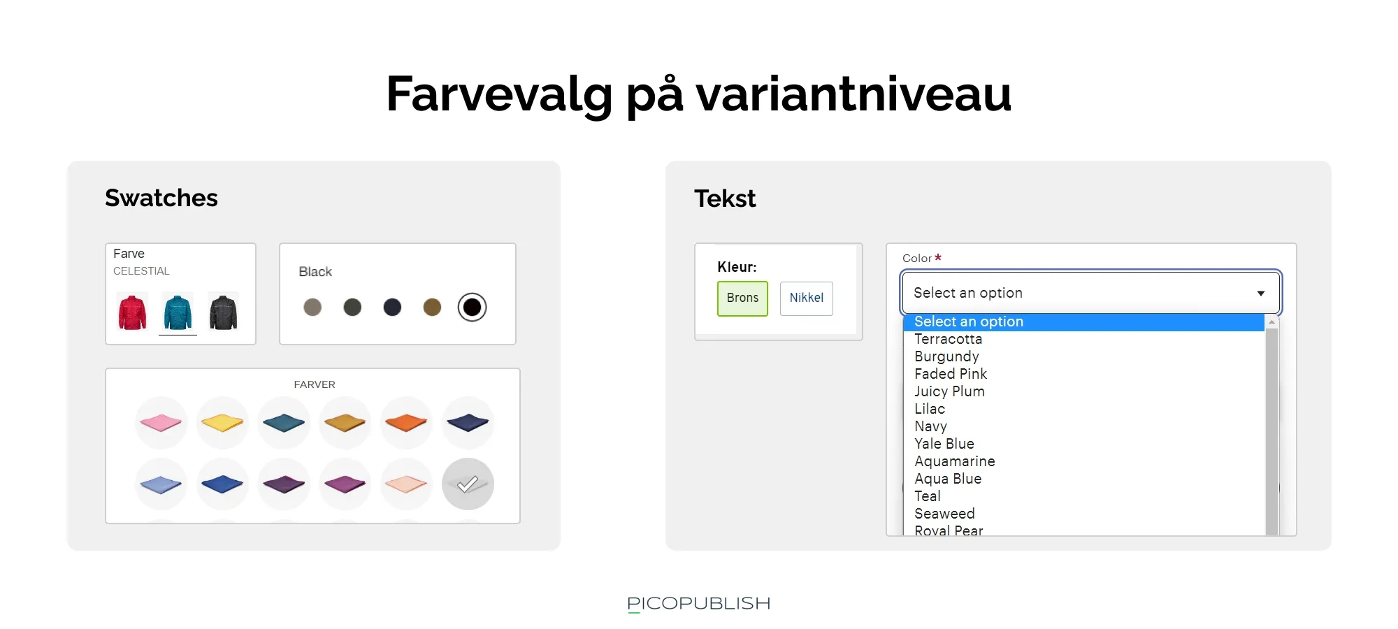
Swatches (on the left) make it easy to overview many choices at once. Feel free to use swatches in cases where your variants have clear visual differences. Dropdowns are typically only suitable for very long lists of options.
Handling sizes
Besides color variations, size variations are one of the most common options.
This is especially true in fashion, where Zalando, Boozt, and H&M account for nearly 10% of total online sales in Denmark.
The same point made about colors can advantageously be applied to sizes:
- Variants hidden in dropdowns cannot be decoded quickly and require more extra clicks
- A recommended tactic is to set size variants as individual buttons.
However, there is one downside to this method; many and long size labels look cluttered.
It is relatively easy to display, for example, shoe sizes as swatches, where the range might be from 37 to 47 — that’s 10 small buttons.
But if your product sizes are named like “Grande Venti XL with three legs and a motor,” and you have more than five options, this overview quickly becomes space-consuming and difficult to design in a user-friendly way (especially when mobile display also needs to be comfortable).
In this case, a “show more sizes” button that expands additional options is a suitable solution.
Offer aids — e.g., size guides
Especially in the categories of "clothing and shoes," formats like size guides help users select the right size and contribute to a better user experience.
As discussed in the first article of this series about images, we also emphasized the concept of "supporting images" that visually convey important product information.
When dealing with, for example, clothing and shoes, a good guide allows you to…:
- ... identify the size variants available for the product (e.g., large, medium)
- ... clearly understand which body measurements correspond to a given size
- ... decode the units used in a familiar format (e.g., the metric system)
Of course, this is not only relevant for the "clothing and shoes" category but for all categories where user guidance creates added value.
What to consider
Benefits and practical actions you can control
Enrich your product pages with supporting documents/tools
In cases where you have the opportunity to offer guiding resources for your products—such as size guides, comparisons, and similar materials—you should consider providing these. They give users the chance to compare variants and assess whether the product fits the “jobs to be done” they need it for.
Present key attributes as swatches
For a category like “Clothing and Shoes,” attributes such as size and color are crucial for the customer’s purchasing decision. If customers can’t immediately see which colors and sizes are available, you risk frustrating them when they discover, for example, that their desired size is unavailable. With swatches, this information is quick to scan, whereas a dropdown “hides” the options.
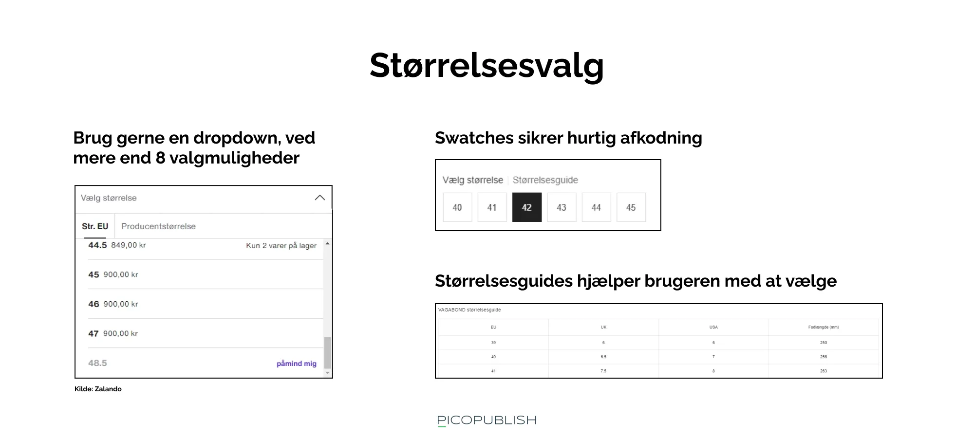
The size selector as a dropdown can be a good solution if you need to present many different variants. A well-made size guide also helps the user make an informed decision.
"Optional extras"
Variants are particularly challenging because the differences from category to category and industry to industry are so significant.
In this section, we've addressed some very general patterns.
What to consider
Benefits and practical measures you can control
Make it easy to identify the product based on the name alone
Make sure your product names accurately represent the features and use cases of your products. In the example of "ULTRA-PRO FISHING ROD 6000-X", it's important that the product actually qualifies for professional use and isn’t just an entry-level tool. Otherwise, it will confuse the user.
Benefit: Prevent users from leaving your site
If a user has to leave your site to find information, you risk them never coming back. They might find the details they need from a competitor and end up purchasing from their webshop. If your product names promise something different from what the product actually offers, you also risk ending up with disappointed users who lose trust in your brand.